
Comic Review: “Godlike: The Romulus Saga” (Secret Door)

I backed Jon Malin’s Godlike: The Romulus Saga in September 2021. Malin claimed it was going to be his best work yet — a project where he returns to interior art after Graveyard Shift II (2020). There were not a lot of details given about the project; intentional secrecy and ‘epic-ness’ were the constant themes. I ended up backing just before the campaign closed out. If it was indeed going to be Malin’s best, I wanted to see what that was.
I was familiar with Malin’s artwork from Jawbreakers, but I never finished reading it. I also have all available Graveyard Shifts and even a preview book for a project that he did with Mark Poulton over a decade ago titled Universals Initiative. So, Malin is no stranger to crowdfunding, to say the least.
With Godlike, Malin is the main name credited for the story and the art, with an assist on the colors. Ben Smith takes the main credit for colors with Korey Barton (Kozor) also assisting, while Eric Weathers (Battlebrick Road) did the lettering. Godlike was originally scheduled to be in people’s hands by September 2022, but it fell into production woes and stalled in the process. Due to this delay, Malin took the time to expand the book from 48 to 80 pages. Even so, Godlike’s lateness has been a topic of contention among backers, especially since Jon “The Coach” Malin often speaks to other creators about needing to run a tight ship when they are working on their projects.
Godlike follows the fall, fight and hope of the last humans on the moon Aksum. In most ways, it is the origin story of Adam-Ra, the main character. The book does have great art and story elements: fighting, sacrificing, kidnapping and even a little romance, but does it all come together?
After reading Graveyard Shift: Omega Storm, a story in which Malin took the lead role in writing, I became worried about how Godlike would turn out. Omega Storm had several branches of story that didn’t really go anywhere, the ending seemed rushed for how long the story was, and there were ill-placed bits of crass and cringe that didn’t add or blend well with the pace of the story. Despite having little hope for Godlike, I have to say that once the meat of the story picked up after the first six pages, I enjoyed what Malin was doing.
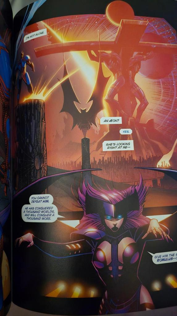
Those first six pages, though, were rough, story wise. It was a meandering information dump with a confusing number of references to times and places, and I had trouble following it all. The first six pages needed a timeline diagram, a map and a glossary to successfully navigate them. If I wasn’t committed to reading the book to provide a review or if I hadn’t spend the amount of money I did ($137 for the book, supplemental, Visions 2 and a sketch), I would have checked out in those first few pages. Once I crossed that hurdle, though, I could see the world and the tale that Malin was trying to produce. There was poetic prose, there were interesting characters, there was conflict, hope and most importantly, a solid foundation and buildup for what is to come in future Godlike stories. Many pages conveyed a cinematic sense, and I can honestly say that the Godlike saga looks like it could very well live up to the ‘epic-ness’ that Malin promised.

As I mentioned above, I had concerns after reading Omega Storm that Godlike would have similar moments of off-putting cringe and crass dialogue. I didn’t want to see shock just for shock’s sake. Rather, these moments should enhance the story elements and situations as presented to the reader. Thankfully, the shocking moments in Godlike added to the despair that characters were feeling or to the experience of their surroundings. The world of Godlike is certainly not sunshine and rainbows, after all, and these disturbing moments were reminders of such.
The art, while not what I’d call “weak,” was inconsistent. Some choices didn’t make obvious sense, and a decent amount of the layouts were blandly cobbled together using wide margins and repetitive basic panel shapes. Once upon a time, margins like these were considered taboo, and I was surprised to see “The Coach” using them. Not all the pages were presented this way, as some characters and visual elements broke through their containment in the panels making the page more visually stunning (even if I didn’t fully grasp what some elements were trying to portray from time to time). Some pages featured panels that didn’t have solid lines bordering them which added to the chaotic feel of the story.
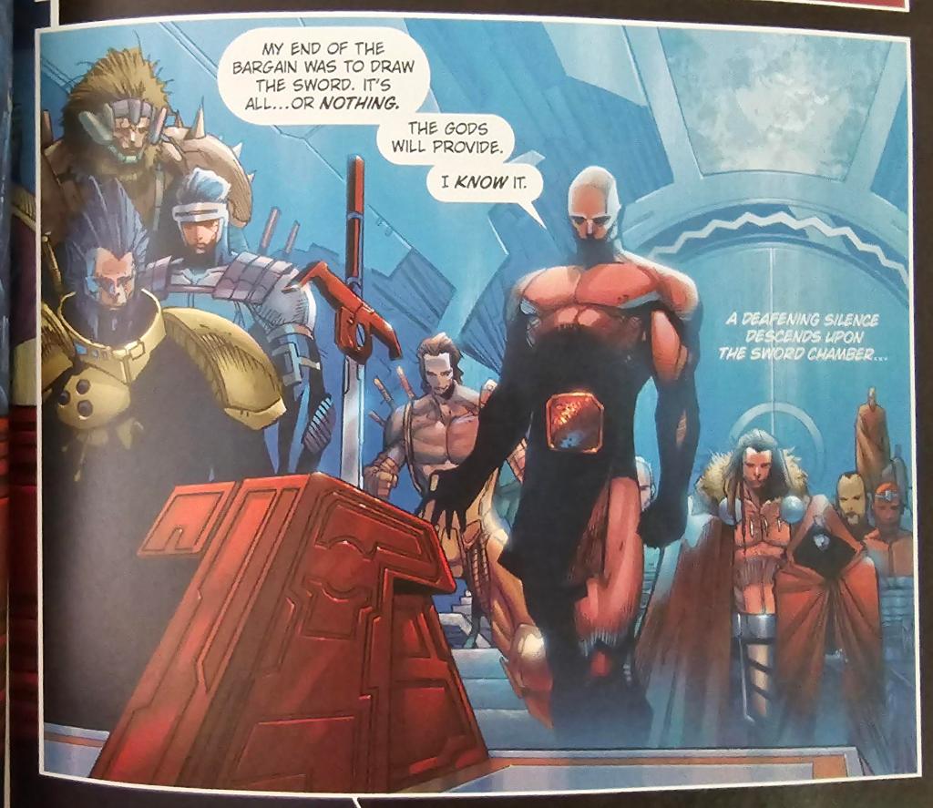
Unfortunately, many of the panels lacked backgrounds and had their primary focus zoomed in on a character. While this is not my preference, I am told it is common of artists that come from a ‘90’s style’ such as Jon Malin’s. Is it an easy cop out to not have to deal with dynamic perspectives? For example, at one point, a group of characters are having a meeting in what appears to be a massive sword chamber. In a later panel, most of the people cannot been seen and the chamber seems barely bigger than a normal room. Maybe this is an artist’s shortcut, but the execution made me do a double-take to see if the characters were supposed to be in the same place, breaking my immersion in the process.
Another odd choice was the use, or rather “non-use”, of word balloon tails. At one point, two characters are shown, but the actual speaker was not definitively clear. Normally, this is not something I would nitpick as there were only a couple of instances of it, but “The Coach” made a big deal on a livestream to criticize another independent project for doing this very thing. A “rules for thee, but not for me” moment?
In seeing some of the online discussion surrounding Godlike, there is a major sticking point that people get caught up on. There are two instances of a double-page spread back-to-back that are predominantly colored black. Some are calling this ‘lazy’, especially after the delay with the book. While I admit that it is odd, I don’t think it’s lazy. These pages did have a purpose and I think this is one of the moments where the book’s cinematic feel was successfully teased out. Without going into too much spoiler territory, the sequence starts with a black panel that tuns into a black double-page spread, which then turns into an ‘explosion’, which probably takes up half of the right hand of the double-page spread. This is presented as “the end,” the fadeout of consciousness, perhaps even death, before a rebirth. While it could have been presented differently, I don’t see anything wrong with how it was done. Dare I say genius? It hit a note hard. It was not lazy. Whether he came up with the idea because he needed to keep a certain beat or a maintain a page turn later in the book, it wasn’t completely obvious to me, but I thought it worked.
The overall book didn’t come out flawlessly, but there were elements of Godlike that I felt hit just right, where Malin’s creativity really shined, making for a pretty solid book. I may be a little biased with my opinion because of what I think may come in later stories more than what was actually presented to me in the first issue, but with a book, with entertainment, that’s a good thing: getting readers invested in what is to come.
Supplemental
As part of the crowdfunding campaign, Malin offered an additional Godlike supplemental book, as he usually does. Inside the supplemental were two stories done by two different teams. The first story, En-Jun, listed the story by Jon Malin, script by Malin and Mark Poulton, art by Justin Murphy (War Party), with colors by Jesse Heagy. The second story, Lords of Abbadon, credited both Jon Malin and Von Klaus with story, with Von Klaus writing the script, Brett Barkley and Clayton Barton (Kozor) doing the art, and colors by Giuliano Peratelli.
En-Jun took place in a more “modern” time (17th century?), presumably on Earth, which I appreciated since I was able to envision things better in terms of the time frame and events. However, the biggest drawback to this story was not being able to keep track of who is who. It wasn’t necessarily due to the art, because Murphy did this story justice (his art is very dynamic which is what this story needed), but the fault lies more along the lines of the character design. Maybe I am being too picky because how differently can you make one native American look like a native American, but different enough from the other six native American characters that are in the same scene?
The second story, Lords of Abbadon, takes place during a time closer to Godlike’s main story, as the plot references a sovereignty on Aksum, the same moon. I personally thought this story was the weaker of the two, probably because I found the timeframe hard to grasp (I believe it is long before the main story occurs… maybe?) and without it being a complete story (to be continued); it didn’t hit that high note that I like to see with stories.

I appreciate both supplemental stories in how they provide more backstory into who Adam-Ra is… or what he is, and his struggle with his ambiguous ‘mission’ that is weaving throughout his lives. It’s a pretty important question that still needs to be answered as Godlike continues, after all.
Should you seek out a copy of Godlike: The Romulus Saga on resale or be on the lookout for Godlike book 2? You’ll really need to weigh your own personal factors as this isn’t a book that you just pick up from a store shelf. As is the case with most crowdfunded comic book projects, there is a hefty price tag and a lengthy wait time that should be taken into consideration before choosing to delve into the world of Godlike. If you can wait, there may eventually be a more economical option, such as a collected edition with a completed story, if Malin has that in his future plans (he does with GYS).
If Malin launched a campaign for the second part of Godlike today, I would be backing. I would forgive his lateness as he is normally timely in delivering his Graveyard Shift books. I would also hope that there would be no additional campaigns that offered Godlike with a special convention variant cover, and that those backers would not receive their books within a year of backing before I received mine. In essence, I would hope that the overall backing experience would be better the next time around, because I believe that Godlike has a good foundation and that what is yet to come will be a great adventure. Epic, even.
Thanks for reading!
Please consider following The Splintering on social media or bookmarking the site for more independent entertainment news, views, and commentary!

The Splintering’s TeePublic store has items for all budgets, great and small! If you like what we do & want to help keep our site 100% free of paid ads, go here!

I think this story seems more interesting than other crowdfunded books I have given a chance to. Disappointed in most of them to be honest.
LikeLike