
Crowdfunding Review: “Johnny Phantasm 1985” (Riot Press, 80s August Special)

Welcome back to 80s August, The Splintering’s month-long celebration of the greatest decade since the fall of Atlantis!
Today, we’ll be reviewing the crowdfunded comic book Johnny Phantasm 1985 by Patrick Thomas Parnell and Evan Pozios. For those of you not familiar with my crowdfunding review format, I grade a crowdfunding campaign on four distinct categories:
- Book Content and Quality
- Communication and Fulfillment
- Packaging and Shipping
- Stretch Goals and Bonuses
With Johnny Phantasm 1985, I backed the book multiple times. I will be reviewing both the Full House tier and the It’s Golden tier together. Everything was exclusive to Indiegogo. Did Johnny Phantasm 1985 evoke the era of big hair, Pac-Man fever and Saturday morning cartoons? Read on and be sure to let us know in the comments below if you found this review totally radical or bogus.
Book Content and Quality
Johnny Phantasm 1985 was created and written by Evan Pozios and Patrick Thomas Parnell, with art, design, and layout credits going to Patrick (and art assistance by Jay Cornwell, Chis Ariswendha, and Panta Rea). There was no lettering or editing credits listed in the book. This story is a 48-page sequel to the previously released Johnny Phantasm 1977.
Johnny Phantasm 1985 furthers the adventures of the titular character, and expands upon his time in New Detroit. It’s been eight years since the previous story, and now we see Johnny in a battle for power over his beloved city. He’s being challenged by a politician with a dark secret, and there is also an evil force controlling the children of the city. Not only that, but Johnny now is suffering from a ferocious compulsion to hoard gold, be it bars, jewelry or even statues. This urge is all consuming, and he must feed it.
The comic was a worthy sequel to the original, and in my opinion, a superior entry to 1977. The story was much more cohesive, with a much-improved pacing to its predecessor. Plots and themes were introduced and given time to grow and be resolved, with just enough of a teaser at the end of the book to have the reader excited for the next installment. The dialogue between the characters seemed so natural, you could almost feel the conversations happening. Everything flowed with ease. References to Darth Vader, DeLoreans, and A-Team-styled vans helped bring the 1980’s to life. That being said, I wish there was a bit more 80’s injected into the atmosphere. Still, a very satisfying story, overall.

The artwork on this book fits so well in the New Detroit setting. Patrick Thomas Parnell’s drawings of the characters and the city are exactly how they live in my imagination. The book suits Parnell’s strengths, and he really goes all out with some of the panels giving the reader a treasure trove of imagery. I did notice that the art style changed slightly within the book. Early on, the art had a thicker inking line and that line became thinner later in the book. This is most evident in Johnny Phantasm’s facial features. Regardless, the art fits the story like a glove.
The book featured some unique panel layouts. I found some to be inspiring and borderline genius, while others left me scratching my head. On the very first panel of the very first page of the book, you see a van driving down the street, and even though all of the dialogue on this page is coming from that van, you can see a plow racing toward it in an intersecting lane. You can tell it’s racing because of the placement of the plow. It’s actually mid-off panel in the gutter of the page. It’s brilliant placement. Similar designs happen throughout the book, with characters and objects breaking panel into the gutters frequently, providing a unique feel to the book. It’s ingenious moments like this that get me excited to read comics.

Unfortunately, there are other moments that I felt could have been resolved with tiny little changes/edits. Once again, starting on page one, it would have been nice to see somewhere (maybe even on the inside cover page) a recap of the story from 1977. This would both help refresh the story to returning readers, and help catch up readers new to the Johnny Phantasm universe. After all, it wasn’t just one issue separating stories, but eight years!
There was another moment that contained a beautifully laid out double-page spread, which was meant to be read in a U-shaped pattern, so top down from the left, and bottom up from the right. This is not a natural reading sequence in western comics. It was an inspired layout that would’ve been aided by directional arrows for the readers.
Finally, there was a major enhancement that all readers were asking for, that still fell slightly short. One thing folks were calling for after Johnny Phantasm 1977 was for a way to discern who the narrators were during certain sequences. Who was the voice we were hearing? This was addressed rather elegantly in 1985. Red seems to be a key color to the three kings, so a red outline was placed over all narration done by the three kings in the book. Problem solved right? Well, not when you place those red-bordered narration boxes over a red background! Something as simple as putting a fine black border around the red to separate the colors on page would’ve worked beautifully. Still, I am pleased that these little changes are being made.

The quality of the book was promised to be newsprint. Originally intended to be printed with Alterna’s Printing Partnership Program, things changed to an unnamed printer. I have to say I saw no major differences between the end product of 1977 and 1985. If anything, I found the quality to be a tad better in 1985. There were two oddities though, that didn’t necessarily detract from the book, but should be mentioned.
First, the Michael Golden cover was the traditional staple bound newsprint format, with two binding staples. For some reason, the Patrick Thomas Parnell cover contained three staples. Was that something done intentionally? Was it unique to only my issue? I really don’t know.
Secondly, the dimensions of the comic were slightly off based on standard current comic size. A traditional modern comic book measures 6-5/8 inches wide by 10-3/16 inches high. Johnny Phantasm 1985 comes in at 6-5/8 inches wide by 10-5/16 inches high. That’s a full 1/8” height difference between this book and a standard modern comic. It’s small, but noticeable, when stacked against my other floppy issues.

All that nit-picking aside, Johnny Phantasm 1985 was a very fun, very enjoyable, and extremely satisfying entry in the Johnny Phantasm universe. This book was a pleasure to read, and a welcome addition to my collection. I will most definitely be backing the sequel.
To briefly summarize any item outside of the main book that came with the tiers I backed, be it a post card or poker chip or stickers, these items were of the highest quality. The post cards shine like photographs, the stickers have a great satin finish to them, and the poker chips are of the same quality as the best Las Vegas casinos. These items are premium grade.
Grade: A-
Communication and Fulfillment
I pledged to the Johnny Phantasm 1985 campaign multiple times, first in August 2020, and once again when the variant cover was launched in October 2020. Still, I base the timing of delivery from when the 60-day campaign closes and when I actually receive my perks. The campaign closed October 2020, and I received my books March 2021. Although the books were promised to be delivered in time for Christmas 2020, and many people viewed the books as being late, a five-month turnaround time from campaign close to delivery is about what you’d expect under the current circumstances surrounding us.
The campaign creator was not active with posting updates to his campaign page. This may have been intentional, as not to bog his backers down with emails. I, for one, do appreciate updates. I would’ve liked to have seen more details provided on the overall status of the campaign. Still, I would say the campaign did the average amount of work in both communication and fulfillment. Nothing more or less than what would’ve been expected.

Grade: C
Packaging and Shipping
I saw an update that items were being shipped. I received an email providing me a tracking number and method of shipping, so I could track my package. Also, my items were shipped USPS Priority Mail, the premiere shipping option of the USPS! A Gemini mailer was used to package all of my items.
Unfortunately, the packing was flawed. Although the comics were bagged and boarded, the bonus items (such as the cards and poker chips) were packaged behind the backing board. Since I had two sets of items, the books were stacked on top of each other, meaning the poker chips from the first book were pressing on the face of the second comic book, leaving poker chip imprints on my one comic.
Additionally, the one perk I backed came with three tiny pin-back buttons. Those pins were shipped sitting on top of the top comic. In transit, those pins then pushed into the comic book causing piercing through the cover. I did reach out to the campaign creator, who got back to me very quickly. I’m happy to say that as of this writing, he has already sent me a replacement book for the one ruined by the pins.
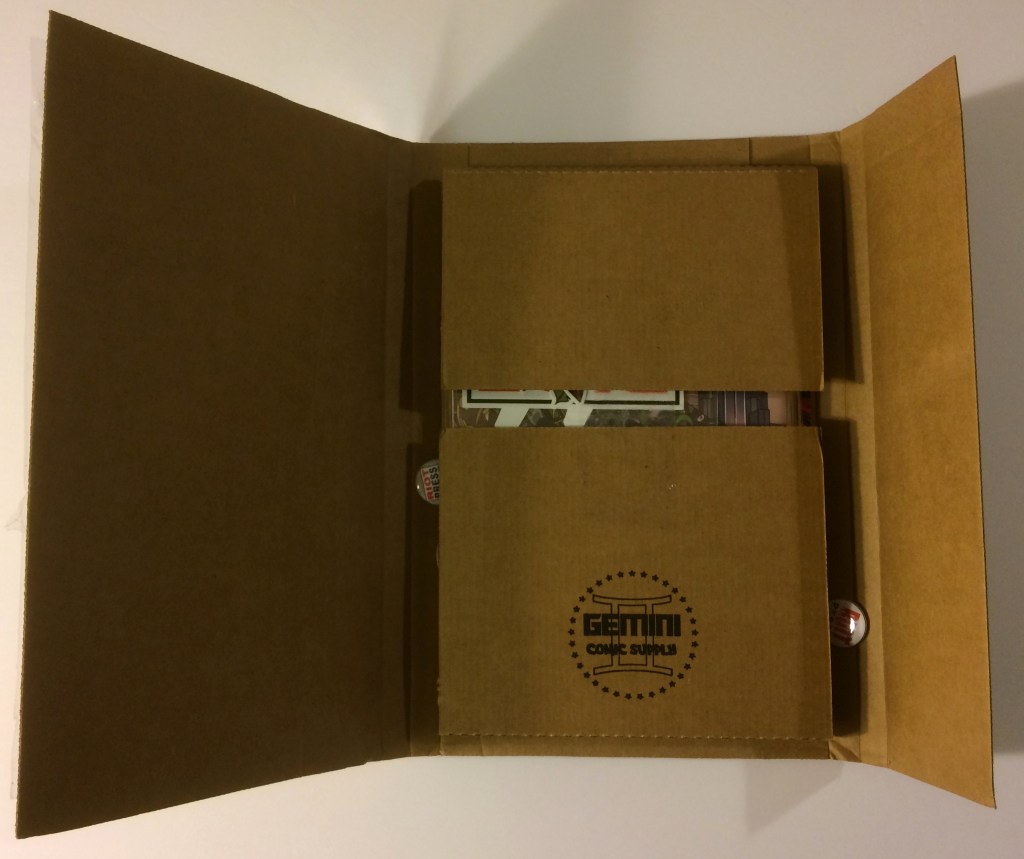
Even factoring in having been provided the tracking, the upgrade to priority, the use of a Gemini mailer, and the use of bags and boards, I struggled with the quality in this category. More secure packing must be used in the future. You must account for potential damage in transit. Simple things like having the books face each other so that the poker chips face outward, or taping the pins to the upside flap of the interior part of the Gemini mailer can help prevent a lot of problems. Additionally, one layer of bubble wrap or a plastic bag taped securely around the interior will help prevent items from sliding around.
Grade: C
Stretch Goals and Bonuses
This campaign unlocked a nice assortment of bonus items for backers, that included:
- 5 trading cards
- 3 poker chips
- A fold-out poster
Each of the bonus items were of exceptional quality. The only complaint I have is that the poster had to be folded. I know it’s unreasonable to expect an 11” x 17” poster to be shipped flat, but it does hurt to see such a beautiful piece folded. Still, that’s a small complaint. To be honest, the three poker chips alone had me won over, but adding on those beautiful Garbage Pail Kids-themed trading cards really solidified the grade in this category for me. The cards produced in this campaign were of the same high quality of a baseball cards you’d buy at a store.

Grade: A
I was very pleased with the Johnny Phantasm 1985 campaign. The categories that I think most folks would care about the most, scored the highest. Some folks just don’t care about the communication, and others aren’t really concerned about the shipping. I grade everything to have equal value, not putting an emphasis on any single category. I can’t help but wonder though where the Johnny Phantasm 1985 campaign would have ranked if just some minor changes were made to communication or packing. It would have potentially rivaled some of my highest rated campaigns. That being said, the overall grade earned here is not easily achieved.
Overall Grade: B
Before you head out, I got a chance to review and discuss Johnny Phantasm 1985 in-depth with Leroi on his YouTube channel, which you can watch below.
Thanks for reading!
To check out more of our 80s August content, go here! Please consider following The Splintering on social media or bookmarking the site for more independent entertainment news, views, and commentary!
The Splintering’s TeesPublic store has items for all budgets, great and small! If you like what we do & want to help keep our site 100% free of paid ads, go here!

Pingback: Crowdfunding Review: “Monster M.D.” (Rise Again Comics) | The Splintering
Good review. Thanks for your great work
LikeLiked by 2 people