
Crowdfunding Review: “499” (Richard C. Meyer, Per “Narwhal” Berg)

Successfully crowdfunded earlier in 2021, 499 is a collaboration between Richard C Meyer and Per Berg (Narwhal), the coupling of the two affectionately known as “Narzack”. The sci-fi concept is from the mind of Meyer, while the art is done in Narwhal’s unique, cartoony style. The bones and flow of the story were shaped over conversations via email between the two. Between Meyer’s proven successes and the unique way that Narwhal told his previous stories (Earthbound and Foreign Agent) it was a match up that many people were curious and excited about. It raised over $60,000 in the one month of being active and is currently sitting just over $86,000 while still being in demand.
My experience with Meyer’s previous works is limited. I started, but never finished, a copy of Jawbreakers: Lost Souls that was loaned to me. Any experience with Narwhal was just through word of mouth of Foreign Agent. On more than one occasion, I heard that Foreign Agent was a fan favorite and one of the better ComicsGate indie books from 2020. While the art style was “different”, the art and the story created a cinematic vibe.
When the 499 campaign launched, I backed it to essentially receive Foreign Agent. So, for my contribution, I received 499, POD (Payment on Delivery), and Foreign Agent. For this review I will just be grading the 499 graphic novel in the following criteria:
- Book Content and Quality
- Communication and Fulfillment
- Packaging and Shipping
- Stretch Goals and Bonuses
Book Quality and Content
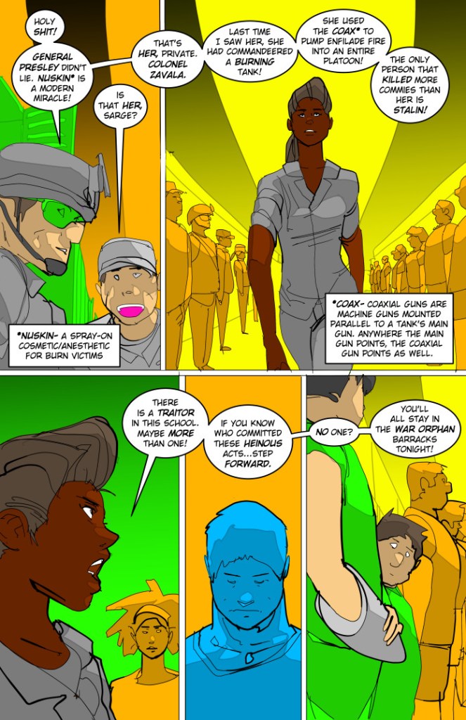
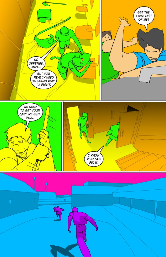
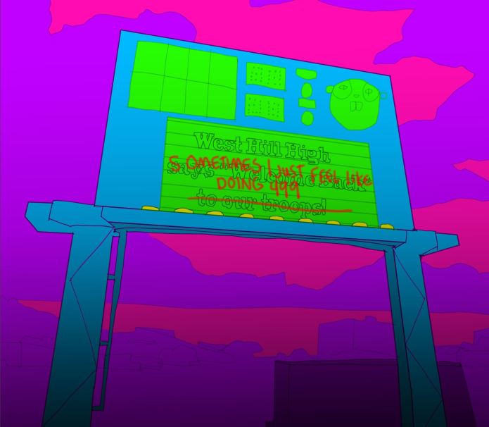
499 is a 64-page, perfect bound one-shot graphic novel with a satin finish cover. The pages are a nice, thick quality with no major complaints on panel layout or the lettering. The book had a few splash pages, but no double page spreads. There is a white border around all the sequential pages. The margin and the panels look clean, but the layouts do not look dynamic.
The dialogue used was believable for the book, but some of the technical words that were used to immerse the reader into the world, brought me out of it. I felt that having to read a definition box took away from the flow to the story. The sound effects in the book were unique in the way they all appeared in a handwritten font. It was unique and worked well with the art’s simplistic style.
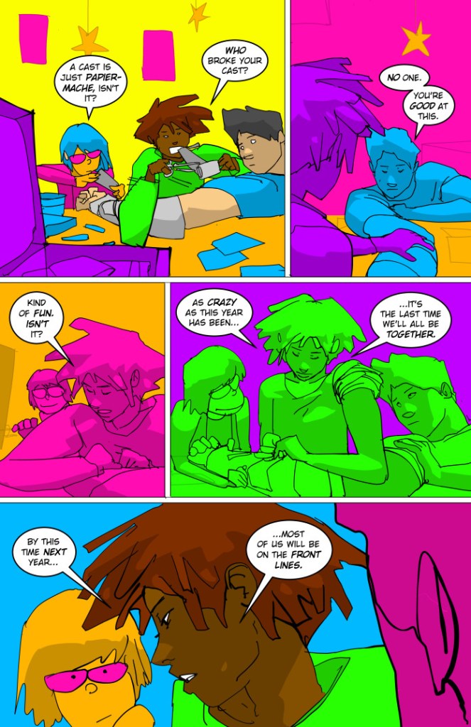
The story follows a group of a seniors that are worried about finishing the school year and being drafted into war. Their parents before them are war heroes and the expectations for the kids are strong and taxing. I really enjoyed the story, I thought it was both well written and thought out. The story worked to slowly develop the characters and their backgrounds, while observing their interactions and trying to solve a whodunit. While I was entertained by the unexpected ending, I do need a little more closure for the WHY behind the ending.

When the campaign launched, it was advertised as a 72-page graphic novel with a completely different color palette than what was printed. The original colors were more muted earth tones, instead of the final printing of a primarily neon palette that Meyer referred to as “bisexual lighting”. I will get into this more with the communication portion of the review, but this change was done after the initial funding of the campaign.
The color change came out of nowhere and became a hot topic among backers and followers of the project. So much so, that Meyer made a video update titled “RE-PITCHING 499- Or… How I Learned to Stop Worrying AND Love “Bisexual Lighting”. In this video, he tried explaining the thought process behind 499 and the change of color palette despite the book being done ahead of schedule. I had to watch the video twice. I understood that the underlying reason was that he wanted to use the colors to create more of a mood. Since it is a story about teenagers, they were wanting to portray the feeling of immaturity. They were planning to use the limited palette to allow the scenes to be more focused and just relay any changes in tone, time, and locations with the colors.
With Narwhal’s cartoon style and the suggestion of the crazy bright colors, I figured it might be a hard art style for me to enjoy, but I still had a glimmer of hope that the storytelling would pull it off. Even knowing the goal of the color change, after reading it, I did not see where it benefited the book. Narwhal’s art is not big on details, it’s his simplistic style that makes his art recognizable. When you add crazy colors, it makes those shapes, and how your mind’s eye SHOULD envision them, tougher to determine. Anything that should be humanoid, became more puppet like. Or a shape that you should recognize as an arm, not an arm because it was neon pink.
Aside from this, it was not an instance where specific characters were a consistent color, they would change from page to page, and even between panels. The same thing happened with the background of the images; I did not see any consistency. Despite trying, I could not get the FEELING of the colors that were supposedly being portrayed with the art. Instead, it had me flipping back and forth pages to see if I am following who I think each character is. Even at times (seemingly random), they would show the characters in “normie” colors of flesh tone and hair color. I could not follow the WHY of the change in the book and it took me away from the book trying to solve it.

Grade: D
Communication and Fulfillment
The campaign page was managed by Richard Meyer with the production side being done by Narwhal. So, the updates came from Meyer based on emails/conversations with Narwhal.
The communication with 499 started out well. There were updates every couple of weeks in regard to progress, stretch goals announced, when goals were met, and even some pictures of art page progress. Then there was a large gap of almost two months where there were no updates. The deadline of March for fulfillment had come and there were crickets, until March 31st. It was with this update that it was announced the art for 499 and P.O.D. were done and lettering for 499 was to be completed within the week. It was short, direct, and lacked explanation for the long delay of updates or even why the campaign was behind schedule.
The updates following the delay were back on track to every couple of weeks with similar information, but it was not until nearly six months after the launch of the campaign when backers were told about a change in the coloring palette via a link for a YouTube video. However, this backer found out about it from seeing it on a livestream that was promoting the book. At some point in time, the art on the campaign page had been drastically changed. The colors used to be a dark earthy palette, and they changed to a bright neon one that was made up of about eight colors for the whole book.

On a personal note, I did not take this change well. It was not the book that I had pledged to. I did express my opinion to Meyer through the campaign page. His response was short and only asked if I wanted a refund. I declined because I had also backed Foreign Agent with my campaign tier. Receiving Foreign Agent was my priority. I was not the only one to complain/express disbelief in the change as Meyer received quite a few comments regarding such on the campaign page, he also received expressions of trust in his choices. At the time, I still held out a small bit of hope that I would love 499 without getting a headache.
There was another comment left right around the same time as mine, that did not outright ask for a refund, but expressed concern about the directional change and feeling misled; Meyer commented “I refunded your money”. I am sure Meyer was feeling some pressure with pushback of his announcement, but I felt this response was out of line.
Fulfillment started at the end of May, just over six months after the campaign launched. This amount of time is a good turnaround time for crowdfunding. However, when looking at the promises that were made during this campaign, it should have been fulfilled three months earlier. There was never a final explanation in the updates as to why it was late considering it was announced being ahead of schedule at one time. This was only addressed in the YouTube video that Meyer did. He explained that they were finished a month before and due to that, they had time to thoroughly review what worked and what did not. The result was a much more streamlined story, a reduction in characters and storylines, and the color palette. They were proud of the product that seemed to feel like a true mesh of both their styles.
Grade: C
Packaging and Shipping
This was the third physical book that I have received since I started backing crowdfunded comics in late October. So, when people started receiving their copies and posting to social media on June 4th, my excitement level amped up. On June 15th I received notice that “Richard Meyer has sent you a package”. It was being sent via media mail with the USPS and estimated to arrive in 8 days. I was slightly confused by the order of the shipping. When discussing with other backers as to whether they received their books or tracking numbers, despite their backer number being lower than mine, I received mine before they did. Perhaps the packages were sent based on the tiers, or some other criteria.
All three books were delivered in a Gemini mailer that had the edges sealed with packing tape. Inside, 499 and POD were wrapped together with the stretch goals, and Foreign Agent was wrapped alone. They were not in a resealable sleeve, but they were in a thicker plastic wrap that appeared to be sealed by heat. I had to damage the wrap to get the book out. The wrap that the items were shipped in was durable and protective but is not reusable to store the books for future use, which is a little disappointing. While the items arrived in good shape, with no noticeable scratches, dents or dings; I would have preferred to have it in a sleeve with a board for storing purposes.
Grade: B
Stretch Goals and Bonuses
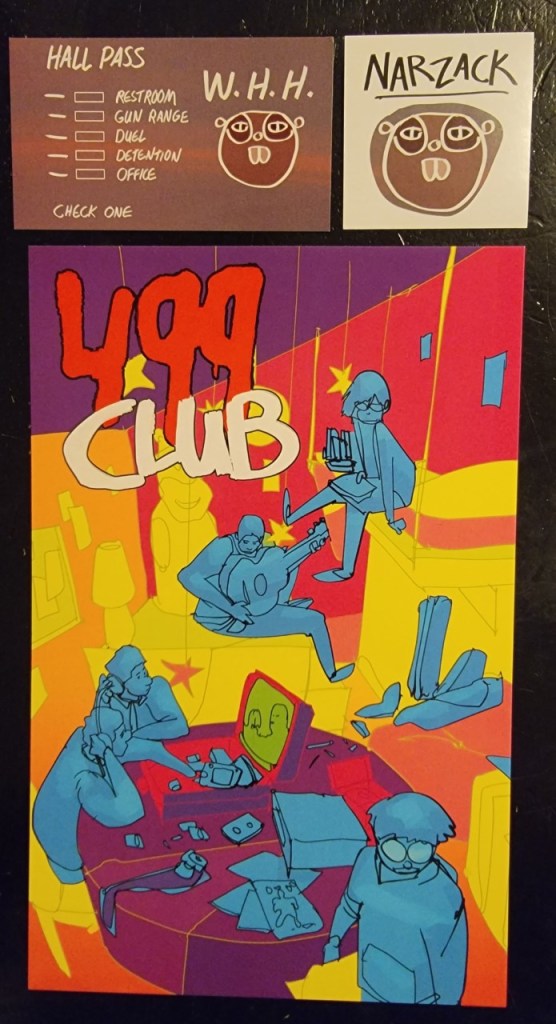
The stretch goals started high and seemed on the minimalistic side despite this not being either’s first campaign. The first stretch goal for the campaign was at $50,000. When the funding reached this point, it unlocked some “Narwhal Stickers”. What I received was a single 2×2 “Narzack” sticker. I find the sticker to be cute and creative showing the collaboration between Narwhal and Meyer, but the item does not fall into multiple Narwhal stickers that was implied on the campaign.
The next goal of $60,000 was an “Alpha High Hall Pass”. This is a one-sided glossy business card with the image on the front depicting a ‘hall pass’, complete with the boxes to check as to where the pass holder would be headed.
The last stretch goal that was reached before fulfillment was one at $75,000 and offered a “large post card print”. It is an 8.5 X 5.5-inch neon colored cardstock print that fits the color scheme of the published book. The update that showed the image of the post card was the first hint of the neon colors, but it did not state the book would follow the same color scheme.
Grade: C
I honestly do not know what to think of 499 and this campaign. I did have high hopes for what this could be. I was let down by the communication and the decisions regarding the art. The colors did not do Narwhal’s unique art justice. There were promises made in the campaign that were broken. The story was good, but not enough to overlook the need to flip back pages to try and follow the characters and what was going on.
More than anything else, 499 felt like a bait and switch campaign. I backed the book looking one way, but received something totally different. Pages, scenes and the colors that were shown on the campaign page through the active campaign were not in the final product. I am disappointed in what I received compared to what I expected. Yes, I did have the opportunity to refund, but I chose not to.
Regarding whether I would back a second book by the duo, I am not sure. I do know that I would not back it until that book is in fulfillment. I would want to make sure that what I am pledging money to is the product that I would receive. If 499 was originally presented in the neon color palette, I probably would not have backed it. On face value, it is not appealing. I think the book could have been improved if it would have kept the original color palette – the “Zack palette” was a detriment.
I did start to read Foreign Agent so I could have a baseline to compare the potential of Narwhal’s art. The book used a more natural color palette. Between the story and the art, I did find the book to flow much better. There was a smooth cinematic vibe. I did not need to flip to past pages to confirm whether I was following things correctly; which is more than can be said for 499.
Overall Grade: C
Let us know in the comments below if you have read 499 and whether you liked the changes for the art or any of the other aspects. You can still snag the book in demand via Indiegogo here.
Thanks for reading!
Please consider following The Splintering on social media or bookmarking the site for more independent entertainment news, views, and commentary!

The Splintering’s Teespring store has items for all budgets, great and small! If you like what we do & want to help keep our site 100% free of paid ads, go here!

Nice review. I recall seeing the original art and thinking it was decent and then the subsequent changes really turned me off on the product. That said, I didn’t back it. It just didn’t hit the right marks for me. On a related note, I like Narwhal’s art when it was in Earthbound because it’s a quirky, sci-fi, reality-bending story but I don’t think that style should be applied to everything.
LikeLiked by 2 people
Agree, very disappointing result paired with rude replies and overall bad communication. I ordered Impossible Stars and Foreign Agent otherwise I would have refunded. Not sure it did anything good to the Narwahl brand.
LikeLiked by 1 person
Pingback: Splatto Comics Launches First Jawbreakers Solo Adventure with “Knife-Hand: Blindspot” | The Splintering
I actually backed this after Meyers’s “re-pitching” video. I didn’t pay much attention to the art discussion, and backed it mainly for the story. I agree with you that the art might not have been a good decision – it took me about half of the book to finally get used to it, and I’m still not a fan – but I do at least give Meyers props for trying something different with the medium.
I’m still trying to process how I feel about the story. You’re right that the “WHY” for the ending could have been better – I think a huge part of it is the effects of PTSD on someone who had issues to begin with, and also getting tired of some of the institutional BS of the military. I mainly got that out of the story because of my own experiences in the service – there are indicators/hints in the story, but you have to know what to look for.
LikeLike
Pingback: Mail Call! “499” by Richard C. Meyer and Per (Narwhal) Berg | The Splintering